Saturday, 31 December 2016

The Gimme LEGO Awards 2016

Welcome to the sixth annual Gimme LEGO Awards and my personal take on the LEGO highlights and lowlights of 2016. Those who have waded through my choices in previous years will be well aware that the majority are entirely subjective and it's therefore likely that you'll disagree with at least some of them; please therefore feel free to argue the case for alternatives in the comments below. Let's get started....

1. Best Theme

Last year's winner: LEGO City

2016 winner: Ninjago

Ninjago burst onto the scene back in 2011, and if you'd told me then that the theme would still be going strong five years later, and that I'd be choosing it as my LEGO theme of the year for 2016, there's an excellent chance that I'd have laughed you out of the room. And yet here we are....


In some ways it's not actually such a surprise that Ninjago gets the top spot this year - it merited an honourable mention last year in the 'Best Theme' category, and 70751 Temple of Airjitzu got the award for 'Best Non-Licensed Set', so the signs were there. The theme has reinvented itself year on year and has retained it's popularity, defying LEGO's attempts to kill it off in 2013 and eventually arriving in 2016 with an excellent and varied line up of quality sets to suit all tastes and budgets.


It could reasonably be argued that unlike the Temple of Airjitzu in 2015 there isn't a true stand-out set in the 2016 Ninjago line-up, but what eventually propelled Ninjago to the number one spot this year was the sheer volume of excellent offerings across all price points. Ninjago has also been astonishingly eclectic this year, continuing to provide fans with theme staples such as dragons while also including a selection of sets which embrace a distinctly Steam Punk-like aesthetic and even offering up a Ninjago-styled Batcave in the form of 70596 Samurai X Cave Chaos (below) which frankly gives the various official LEGO Batcaves a run for their money.


Aside from the way the sets look, most are also packed with play-features, a great example being 70595 Ultra Stealth Raider (below) which splits into sub-models each of which itself incorporates multiple mechanisms and moving parts. While the main focus of the Ninjago theme has always been one of 'play' rather than 'display', the designers have nevertheless managed to make the many of the builds look great, thus broadening the theme's appeal well beyond the 7-14 target audience.


It's testament to the fantastic Ninjago line-up this year that I found it genuinely difficult to decide which five sets to feature in the pictures above and below as there were so many great sets to choose from; in the end I had to leave out the likes of 70605 Misfortune's Keep70594 The Lighthouse Siege and 70602 Jay's Elemental Dragon but they could just as easily have featured. So well done to Ninjago - still going strong after five years!


Honourable mention: Architecture. Yes, really. When I reviewed 21029 Buckingham Palace (below) for Brickset earlier this year I felt duty-bound to admit that I was largely ambivalent about LEGO's Architecture theme which has at times felt like the epitome of style over substance. The early Architecture years featured a slew of grossly overpriced and frankly risible representations of world landmarks which only caught the eye thanks to their plush packaging and luxurious instruction booklets. The emperor's new clothes, basically.


Over the years the quality of the offerings has definitely improved, though, and 2016 has been a watershed for me with some really rather nice offerings such as Buckingham Palace rubbing shoulders with a new sub-theme of city Skylines which have taken the theme off on a promising new tangent. They're still overpriced, to be honest, but most of this year's Architecture sets look great and are definitely worth seeking out.

Honourable mention #2: Technic. My historical lack of enthusiasm for LEGO's Technic theme has been well-documented, so to some folks this honourable mention might be the biggest surprise of all in this year's Gimme LEGO Awards....


My historical downer on Technic can be traced back to two main factors, the principal one being the unsatisfying skeletal appearance of many older Technic sets, with the mind-numbing tedium and misery of deconstructing the builds sealing the deal. While the latter obviously remains, the increasing use of panels has greatly improved the appearance of official Technic builds, to my eyes at least. This year has seen the release of a number of Technic sets which have combined complex mechanisms with interesting subject matter and great looks; I'd go as far as to say that the summer 2016 Technic line-up was possibly the strongest of any theme, with 42056 Porsche 911 GT3 RS (above) possibly the pick of the bunch. Definitely Technic Temptation rather than Technic Torture....


2. Most Disappointing Theme

Last year's 'winner': Not awarded

2016 'winner': LEGO Classic

This is basically a ‘victory’ for quantity, and specifically the lack of it, rather than quality; for what it's worth I'm actually a fan of LEGO Classic sets, so I guess you could say that this is a relatively minor rebuke....


I’m sure that, like me, many of you have rolled your eyes at the oft-repeated mantra that LEGO "isn’t what it used to be", how creativity is being stifled by all the licensed sets, and how “in my day it was all basic bricks and we had to use our imaginations”. Like me you may have defended the LEGO company, making the point that it’s actually about choice, and that purchasers can still buy just basic bricks if they want. Except that when you think about it, getting hold of basic bricks in anything other than small quantities isn't actually as easy as it should be, is it?

Out of a total of 811 set releases during 2016, just three were LEGO Classic sets supposedly comprised of basic bricks. Furthermore, it turns out that those three Classic sets actually contain a fair few relatively specialised elements such as SNOT bricks. OK, so in-store and online Pick-a-Brick also offer a potential solution, but few LEGO fans have access to a Brand Store, and have you seen the price of a single 2 x 4 brick purchased direct from LEGO online? I strongly believe that LEGO should continue to provide the general public with ready access to basic elements, and I think the company is currently failing to do this sufficiently; a quick look at the 2017 release schedule suggests that the company will be releasing more Classic sets than it did in 2016, so maybe LEGO is already on the case - we shall see.


3. The "Medieval Market Village" award for Best Non-Licensed Set

Last year's winner : Set 70751 Temple of Airjitzu

2016 winner: 10251 Brick Bank

A Modular Building has won this award for two out of the last three years, so giving the nod to yet another Modular this year feels a bit lazy. Thing is, though, the alternative would be to somehow pretend that the Brick Bank isn't as good as it actually is, and that definitely wouldn't do, so the Brick Bank it is....


Designer Jamie Berard has picked up where he left off with previous Modulars and given us an attractive model which is packed with interesting architectural details on the outside, fun to build, and overflowing with detail on the inside. What's also impressive is the attention to detail, for example interior floors which are attractively tiled with interesting patterns and colours despite being barely visible, and intelligent use of the available internal space to accommodate as much interior decoration and furniture as possible.


Another treat is the ingenious usage of elements, examples of which include the inclusion of sand blue Nexo Knight shields in the ground floor tiling pattern, the use of light bluish grey ingots to tile the exterior of the buiding, and the inclusion of black animal tail elements to represent ironwork in the bench outside the bank. As well as including a host of interesting elements, the set also utilises relatively uncommon colours such as sand blue and sand green in the build, while the inclusion of a laundrette in one corner of the build means a whole different design and colour palette for this section which looks amazing.


Honestly, apart from feeling a tad small compared with other Modulars the Brick Bank is pretty much faultless, and it's a delight. There's a risk that we might become blase about Modulars and start to take them for granted; if that happens, and folks stop acknowledging how good they are, and worse still stop buying them, then LEGO might stop releasing them which would be a travesty. So Brick Bank deservedly, and unashamedly, gets my vote for 'Best Non-licensed Set", and I wouldn't bet against another Modular gettting the prize next year either....

Honourable Mention: 10253 Big Ben. I did a live build of this set over a weekend at Bricktastic in the summer of 2016 and Big Ben absolutely wowed the show attendees. The build employs some seriously clever element usage in order to approximate the real building's exterior detail, and the ability to simultaneously turn the clock hands on all four clock faces by turning a discretely-located knob is a real crowd pleaser.


As you'd expect there's inevitably a fair bit of repetition involved in the build - I certainly wouldn't recommend rushing it like I had to - but the spectacular end result is well worth the effort; Big Ben is one of the few models which my wife will allow to be prominently displayed in our house such is its allure. Incredible, and my runner up for 'Best Non-licensed Set' of 2016.

Other contenders: 31052 Vacation Getaways, 41180 Ragana's Magic Shadow Castle, 21029 Buckingham Palace, 31044 Park Animals


4. Best Licensed Set

Last year's winner: 75060 Slave I

2016 winner: 75827 Firehouse Headquarters

Given my love of the Ghostbusters movies I guess the winner really had to be the Firehouse Headquarters, didn't it? While 2016 has in my opinion been unusually strong for licensed sets, with some outstanding candidates to choose from, I knew from the moment that I first spied this set that it was going to take something truly extraordinary to shift it from top spot.


On account of the enduring popularity of the Ghostbusters franchise I suspect that any official LEGO version of the Ghostbusters HQ would probably have sold regardless of its quality, but the set we got thankfully turned out to be wonderful. The size and attention to detail is remarkable - a dream come true for Ghostbusters fans - but in truth there's a huge amount for non-fans to admire as well, both in terms of the exterior appearance, and in the interior furnishings and decoration. There's also an excellent selection of minifigures to populate the model, and just about enough room inside to accommodate the LEGO Ideas Ecto-1 set.


It isn't perfect, not least because dark orange would have been a more appropriate colour for the exterior than dark red, but overall it still looks wonderful both inside and out, and you don't need to be a Ghostbusters fan to enjoy and appreciate it either. A serious build, and an excellent display piece.

Honourable Mention: 71040: Disney Castle. Huge, spectacular, and only a whisker away from taking top spot in the Best 'Licensed Set' category, the Disney Castle impresses both inside and out. The back of the model is exposed, which facilitates play but ensures that for some the set will fall a little short as a display model compared with the Firehouse HQ, and the minifigure selection is perhaps a little disappointing, but it's otherwise hard to find fault.


Disney fans will be delighted by the frequent references to their favourite Disney movies, but you don't need to be a Disney fan to delight in the attention to detail, the thoroughly enjoyable building experience, and the beautiful completed model. Highly recommended.

Other contenders: 76057 Spider-Man: Web Warriors Ultimate Bridge Battle21307 Caterham Seven 620R21306 The Beatles Yellow Submarine42054 CLAAS XERION 5000 TRAC VC42056 Porsche 911 GT3 RS  


5. The "Phantom Menace" Award for Most Disappointing Set

Last year's winner:10249 Toy Shop

2016 winner: 75098 Assault on Hoth

If some of my 2016 Awards have come as a surprise then this one was about as nailed-on as they come. Honestly, what on earth were LEGO thinking when they decided to slap the revered UCS badge onto this sub-standard collection of Hoth-related System Scale sets?


Yes, I've heard all the arguments. AFOLs aren't LEGO's target market, they say. And this set allows younger Star Wars fans to get caught up with a number of older Hoth sets in one fell swoop. It's basically nonsense, though, because when it comes down to it UCS has always stood for quality, detail and fan service for older builders, and this just isn't it at all. And the thing is, even if you set aside the UCS thing it's still fundamentally an overpriced, mediocre set. I'm not going to waste any more of my time criticising the set here but I can recommend CapnRex101's exhaustive review in the event that you want to better understand why it's so bad. Thoroughly miserable.


6. Best Minifigure

Last year's winner: The Eleventh Doctor

2016 winners: Gizmo and Stripe 

With the ever-increasing quality of LEGO minifigures, not to mention the ever-growing number of minifigures being released, trying to pick a winner in this category was already a nightmare, and that was before LEGO added a bunch of Dimensions Fun Packs, Level Packs and Team packs to the mix. I've said it before, but the quality of minifigures is now so high that trying to make an even vaguely objective judgement is almost impossible, so I haven't bothered to even try this year and have instead just picked the minifigures that put the biggest smile on my face in 2016, Gizmo (below left) and Stripe (below right).


LEGO Dimensions has turned out to be a massive boon for people like me who were teenagers in the 1980's or 1990's and therefore grew up with the likes of Ghostbusters, E.T., Gremlins and the multitude of other 'retro' film and television franchises currently being snapped up by LEGO and introduced into Dimensions. The various Dimensions expansion packs are a fantastic source of exclusive and beautifully designed minifigures, and it's within these packs that many of my favourite minifigures of 2016 can be found. Gizmo and Stripe ultimately get the award, but only just - the wonderful E.T. minifigure below came very close, and a bunch of others including the Stay Puft Marshmallow Man and Cyberman weren't that far behind either. I'm now waiting with bated breath to see what old franchises LEGO revive next - Thunderbirds, anybody?


Other contenders: Maleficent, Mickey Mouse, Penguin Boy, Nate in hot dog suit.


7. The "Better than Expected" Award

Last year's winner: LEGO Dimensions

2016 winner: Elves

Dismissed by some seemingly by virtue of the inclusion of minidolls rather than minifigures, the Elves theme didn't really strike a chord with me in its first year but it has increasingly piqued my interest in 2016 thanks to some rather nice-looking sets.


I think the problem for me last year was that some of the early Elves sets such as 41071 Aira's Creative Workshop and 41072 Naida's Spa Secret with their brightly coloured, minidoll-populated cutesy builds felt a bit like they were a part of a covert, by-the-numbers Friends subtheme. It wasn't until the 2016 arrival of 41180 Ragana's Magic Shadow Castle (above), a set which I've been meaning to review on Gimme LEGO for some time now, that I really sat up and started to pay attention.


I wouldn't say I'm entirely won over as yet - there are aspects of the theme such as the goofy-looking dragons which really haven't impressed me - but I've seen enough so far to be genuinely interested to see where Elves goes in 2017 and beyond. Definitely a theme to watch, I think.


8. Most Welcome LEGO-Related Announcement

Last year's winner: Set 75827 Firehouse Headquarters

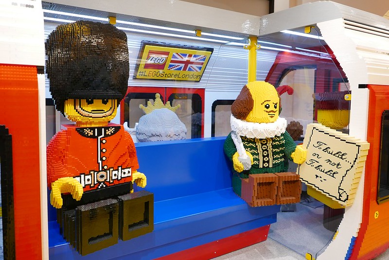
2016 Winner: London Leicester Square LEGO Brand Retail Store and pre-opening event

I'm well aware that folks in the UK have been somewhat spoiled when it comes to LEGO Brand Retail Stores; back in 2012 LEGO even opened a store a few miles from my house so I've been particularly fortunate. That having been said, the announcement back in May 2016 that LEGO would be opening the world's largest Brand Retail Store in London's Leicester Square was still met with considerable excitement in these parts.


The day before the grand opening of the new store LEGO hosted a pre-opening event at the store to which they invited over a hundred AFOLs from UK-based LEGO User Groups. Attendees got to explore the store and meet with LEGO staff including set designers Jamie Berard and Rok Kobe as well as being provided with drinks, nibbles and freebies courtesy of LEGO; you can read more about the pre-opening event here if you're interested.

There has been a suggestion over the past year or two that the LEGO Company is currently so flush with success that it's losing interest in AFOLs. This event, not to mention a number of superb AFOL-oriented set releases in 2016, thankfully provides some reassurance that the AFOL community is still viewed as being important to the company, and long may that continue.


9. Gimme LEGO Reader's Choice Award

Last year's winner: Set 70751 Temple of Airjitzu.

2016 winner: You tell me....

OK, so you've seen my choices and now it's your turn. At the top of the page on the right of the screen you'll see a selection of LEGO sets which I consider to be some of the best that 2016 had to offer. Please carefully peruse the list and vote for your favourite set of 2016; if your favourite isn't on the list then select 'None of the above' and leave a comment below or send me an e-mail via the contact button letting me know which set you think is the best of 2016. Cast your vote - one person, one vote - and at midnight on 14th January 2017 the poll will close and we'll have our winner.... If you're reading this on a device which isn't displaying the poll as described then click "view web version" at the bottom of the page in order to see the nominations and cast your vote. Thanks for participating!

*Voting has now closed - results coming soon!*

Previous Gimme LEGO Awards: 2015, 2014, 2013, 2012, 2011

Monday, 5 December 2016

Friends Reunited

I emerged from my LEGO Dark Ages back in 2008. I've long suspected that the number of sets released annually since then has increased year on year, and a cursory interrogation of the Brickset database would seem to support that notion. According to Brickset, LEGO released a total of 410 sets of all types in 2008. This increased to 454 in 2009 and 501 in 2010, and the total has continued to rise every year since then to the point where in 2016 we're already up to 810 sets at time of writing. So basically a doubling of output in the space of less than 10 years - amazing!

It's fair to say that for much of the past decade my purchasing of sets has grown in a similar fashion. It was modest at first, but rapidly accelerated as my passion for the hobby increased. I reckon that I probably hit my purchasing peak back in 2013 or 2014, but since then I've increasingly tried to put the brakes on due to limited storage space. A few specific themes have borne the brunt of this restraint, notably City and Friends. From a City perspective I've admittedly continued to cherry-pick some specific sets, and I've been unable to resist some of the excellent summer City subthemes such as Deep Sea Explorers and Volcano Explorers, but in truth it hasn't been much of a hardship to forego the annual slew of City Police and Fire sets. Likewise for Friends, while I've felt some regret at passing on a few sets, for instance 41122 Adventure Camp Tree House (below) and 41134 Heartlake Performance School, in the main it's been fairly easy to abstain given the similarity of many sets to previous Friends releases.


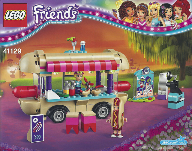
All that having been said, regardless of the rules you set yourself, sometimes something comes along that forces you to make an exception, and 41129 Amusement Park Hot Dog Van definitely falls into that category; when Brickset threw up an alert back in October informing me that the set was 32% off RRP on Amazon I immediately pounced and pushed it to the top of my build queue.

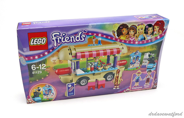
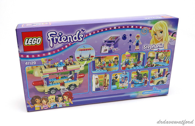
It's been a while since I last built a Friends set, but as far as I can ascertain the box features the same scalloped edges and pretty much the same colour scheme that the Friends theme has been using since it debuted back in 2012. The branding has been subtly tweaked, though, and one obvious evolution concerns the five Friends themselves - while they continue to look out from the top right of the front of the box (above) like they've always done, their hairstyles and outfits are distinctly more glamorous and less "girl next door" than I remember. Looking beyond the branding, the front of the box showcases the completed build, with silhouettes of the Friends amusement park space ride and ferris wheel just about visible in the background, while the back of the box (below) is dominated by a number of vignettes highlighting various aspects of the set.

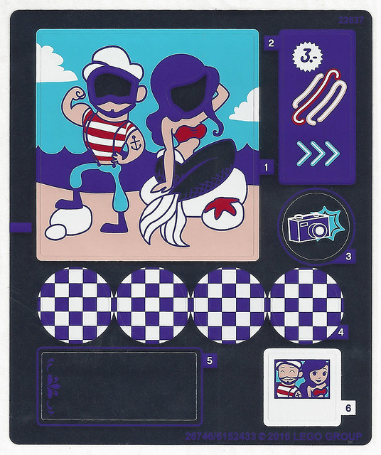
The box opens via a couple of thumb tabs and contains two numbered bags of elements, a single instruction booklet and a small sticker sheet which is loose in the box. You can see a scan of the sticker sheet below; note that all the areas which appear black are actually silver mirrored, but unfortunately this finish can't be reproduced by my scanner.


The cover of the instruction booklet can be seen below. The booklet comprises 64 pages from cover to cover, and in addition to the building instructions the contents include a one-page inventory of elements, three pages of advertising for the Friends theme, and a single page of advertising for the rather impressive 2016 Elves line up.


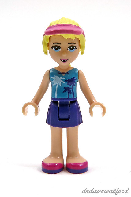
The set contains two minidolls, Stephanie and Nate. While this version of Stephanie (below) is unique to the set, her bright yellow hair complete with dark pink sun visor, her dark purple skirt with dark purple and magenta shoes, and her light flesh head with bright light blue eyes, have previously appeared as a part of other minidolls. Her torso featuring a medium azure top printed with a palm tree pattern is however currently exclusive to this minidoll and has yet to appear elsewhere.


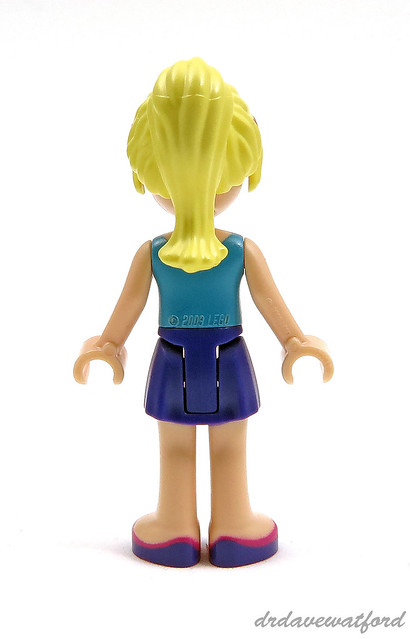
As you can see from the picture below, Stephanie's torso is embossed with an incongruous "© 2009 LEGO" copyright notice which would have been better placed out of sight in my opinion. The head isn't back-printed, so there's unfortunately no alternate facial expression hidden beneath Stephanie's ponytail.


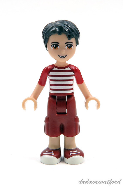
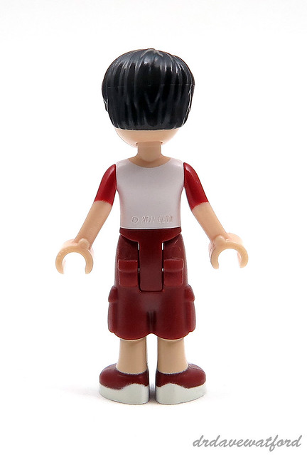
Nate has to my knowledge only previously appeared in a single set, 41101 Heartlake Grand Hotel from last year, and the version of Nate you get in this set (below) is exclusive to the set. All of the elements making up this minidoll have appeared elsewhere, although the dark red cropped trousers with dark red and white sneakers, and the hooped torso print, have each only featured once before.


Like Stephanie, Nate's lower back carries an embossed copyright notice (below) although in this case it's dated 2011 rather than 2009. Once again there's no alternate head print. A pair of small dark red pockets are moulded into the back of Nate's shorts, and the shorts also feature larger moulded side pockets.


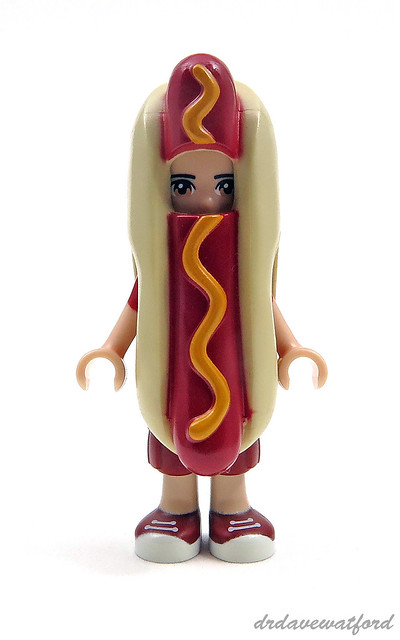
Nate isn't just included in the set to keep Stephanie company - he actually has a job to do advertising her hot dog business. To help with this he's provided with the wonderful hot dog suit that you can see below. This element has only previously appeared on one occasion, as part of Hot Dog Man who was one of the Series 13 Collectable Minifigures released in 2015. In order to fit the suit you remove Nate's hair and just slide the element down over his head and body. It's interesting that the suit fits both minidolls and standard minifigures. I think it looks great - definitely a highlight of the set for me!


Before I move on to the build, a quick comment about minidolls in general. When I first wrote about them back in November of 2011 (you can read my post here) I was pretty dismissive, questioning why LEGO was abandoning the much-loved minifigure for its then-upcoming Friends theme, before rashly stating that I wouldn't be buying any of the Friends sets as a result. Barely two months later however I had broken that pledge, and in my review of 3931 Emma's Splash Pool I went so far as to write "I can't deny that Emma is cute and appealing, with an almost anime-like quality" - quite an about-turn, that.... In addition to their continued use in the Friends sets, and their presence in the well-received Elves theme, minidolls will also feature in the new DC Super Hero Girls theme which will debut in 2017; my enthusiasm for upcoming Super Hero minidolls such as Poison Ivy (below) suggests that I've now been well and truly won over....


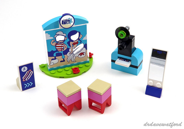
And so to the build. Bag number one kicks off with assembly of the set's two minidolls as previously described, and then it's on to a number of small accessory builds (below) including a distorted funfair mirror, which consists of a mirror sticker applied to a white 6 x 2 curved slope, a couple of bar stools, and what LEGO describe as "a camera with instant photo function" complete with a stickered 2 x 2 tile to represent the photo. There's also a carnival cut-out board consisting of a stickered 1 x 6 x 5 trans-clear panel; this is topped off with a pair of medium azure 3 x 1 curved slopes only previously seen in nine sets, and a stickered dark purple 2 x 2 round tile which is only appearing in a set for the fourth time ever. The carnival cut-out board is mounted on a lime 4 x 8 semi-circular plate which has only previously appeared in a total of four sets.


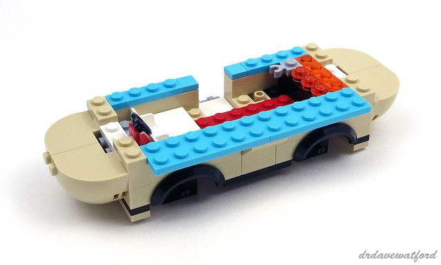
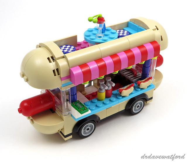
With the accessory builds completed it's time to make a start on the hot dog van itself. This is built on a dark pink 2 x 14 plate only previously available in two sets. There's otherwise little in the way of rare or unusual parts until we get to the bulbous SNOT front and rear of the vehicle which feature pairs of tan 3 x 3 x 2 round corner bricks with dome top which are only appearing in a set for the third time ever in this colour. These elements are mounted on top of a tan 3 x 6 half round plate with 1 x 2 cutout which was previously only available in seven sets in this colour. The trans-orange and trans-neon orange elements that you can see towards the rear of the interior form part of the grill where the hot dogs are cooked.


Construction of the hot dog van continues with completion of the grill which is, appropriately enough, topped off with a number of modified 1 x 2 tiles with grille. A cash register consisting of a 2 x 2 45 degree slope brick printed with a pink, purple and yellow cash register pattern is then installed; this element has only featured in five sets including this one. Trans-clear 1 x 6 x 3 windscreen elements are then dropped into place at the front and back of the van, and stacks of dark purple 1 x 1 round bricks, which are only appearing in a set for the sixth time ever, are installed so as to provide the roof with additional support. Mustard and tomato ketchup dispensers are then placed on the medium azure counter top, as are a couple of hot dogs in buns, thus providing me with my first ever up-close and personal encounter with the wonderful tan hot dog bun element which is only appearing in a set for the sixth time. Talking of hot dog buns, the roof, which can be removed in order to provide access to the interior of the van, resembles a giant hot dog bun thanks to the use of various tan curved slope elements including modified 1 x 4 x 1 1/3 bricks with curved top which are only appearing in a set for the eighth time ever. The roof features a canopy made from alternating red and dark pink modified 1 x 2 x 1 1/3 bricks with curved top which have only previously appeared in a total of seven sets in dark pink. Also located on the roof is a dining area featuring four seats and a medium azure round table; there's a cushion on each seat consisting of a stickered dark purple 2 x 2 round tile. With the roof completed the wheels are attached and we're done.


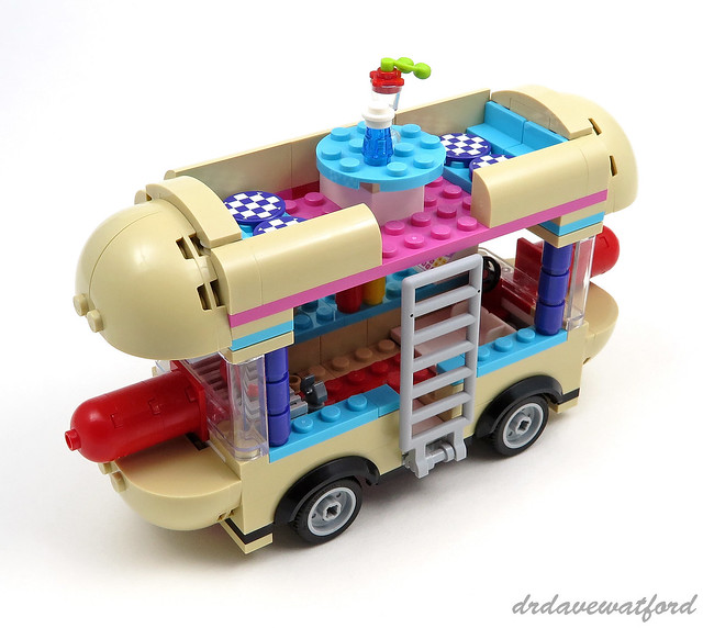
Access to the rooftop dining area is via a ladder which can be seen in the rear-view picture below, and when the ladder is folded down Stephanie can gain entry to the van's interior. The back of the van is pretty much indistinguishable from the front, with only the absence of a steering wheel giving it away.


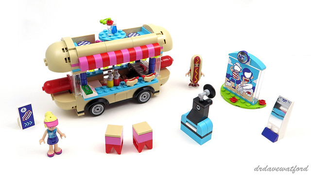
You can see the finished build below complete with all the accessories and both minidolls.


OK, so you don't need me to tell you what a bizarre-looking vehicle the hot dog van is, but it was precisely that which attracted me to the set in the first place and I wasn't disappointed - it's a genuinely fun set which put a big smile on my face. The build is pretty quick and straightforward, with accurate placement of the stickers probably providing the greatest challenge, and it's never dull thanks to all the humorous details plus a decent selection of unusual and/or interesting elements. There's also a good amount of play value for the younger builder thanks to all the accessories, not to mention the inclusion of the hot dog suit which is absolute genius in my humble opinion....

Set 41129 Amusement Park Hot Dog Van contains 243 elements and retails for £24.99 / US$29.99, although like me you may be able to get it at a decent discount from Amazon (UK/US) or other retailers.

Thursday, 10 November 2016

Pick up a Penguin

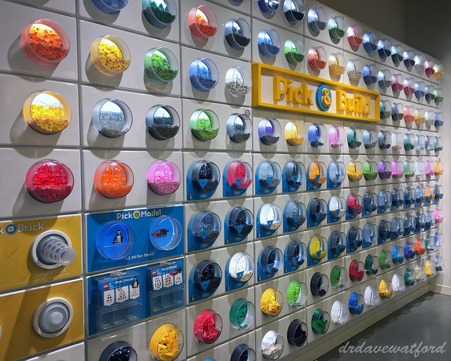
I'm a fairly frequent visitor to my local LEGO Brand Store, and have been known to spend the odd few minutes at the Pick-a-Brick wall (below).... For the uninitiated, this is an expanse of wall embedded with clear perspex containers, each of which contains multiples of a single element in a particular colour; you pick up a large or small plastic cup from the display depending on your requirements and budget, fill it with as many elements as you can squeeze into it, and pay a set price depending on the size of cup you selected. While the choice of different elements is obviously limited, it can still be a good way of getting hold of elements you're looking for, albeit not necessarily at the cheapest price. I often find myself being seduced by all the shiny new LEGO and can't resist filling one or more cups with elements that I convince myself will be useful but which in practice generally end up being added to my stock of loose bricks and never seen again.


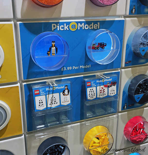
Anyway, in April 2015 LEGO started to roll out changes to the familiar Pick-a-Brick format. A small section of the Pick-a-Brick wall was given over to a new Pick-a-Model station (below) featuring a couple of simple builds and a bunch of blister packs dangling from metal hangers. The blister packs feature three empty compartments plus an additional space above which accommodates a leaflet containing a set of instructions for one of the aforementioned simple models together with a breakdown of the parts needed to build it. Basically, you're supposed to walk around the Pick-a-Brick wall collecting up the necessary elements and put them in the blister pack - a do-it-yourself official LEGO set, if you will.


I think it's fair to say that AFOL reaction to the Pick-a-Model initiative has been, to put it mildly, rather mixed. Some bemoaned the loss of precious Pick-a-Brick slots in the wall, thus reducing the available element selection in stores. Also, reports started to come back of some stores stopping general Pick-a-Brick customers from selecting elements needed for the Pick-a-Model builds, although this wasn't the case for all stores and hasn't been my personal experience. Some have also criticised the cost of the models, which have an RRP of £3.99 in the UK and $4.99 in the U.S.. On the flipside, some of the Pick-a-Model builds have been quite cute, for instance the panda below. The models on offer change periodically, and you can see a selection of the builds that have been available in stores to date here.


Although I've been aware of the availability of Pick-a-Model for well over a year now I've never previously indulged. This is mainly because when I've visited a store and remembered to check what builds were available they haven't particularly interested me. That however changed recently when I saw that one of the current models was a penguin - I can't resist a penguin. So I grabbed the relevant blister pack, dutifully filled it with the necessary elements from the Pick-a-Brick wall, and handed over my £3.99.


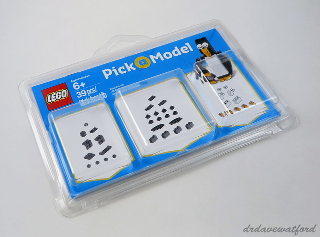
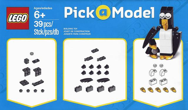
You can see the packaging above; by this point I'd already opened up the blister pack and emptied out the contents of the element compartments in preparation for building. It's worth noting that the packaging is resealable, so that when you're done with the build you can take the model apart and safely store the elements and instruction booklet back in the original pack if you want. The front cover of the leaflet can be seen below, complete with an image of the completed build and an inventory of the elements required to build it.


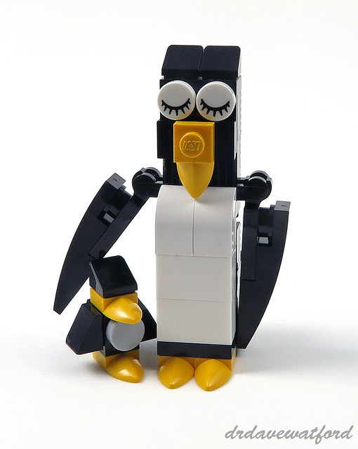
At only 39 elements it's plainly neither a long nor a tricky build, and none of the constituent elements are particularly uncommon apart from the 1 x 1 round tile printed with an eyelash pattern which has only previously appeared in a total of nine sets. You can see the completed build below; the main model, which features hinged flippers, is accompanied by a smaller penguin made up of just eight elements.


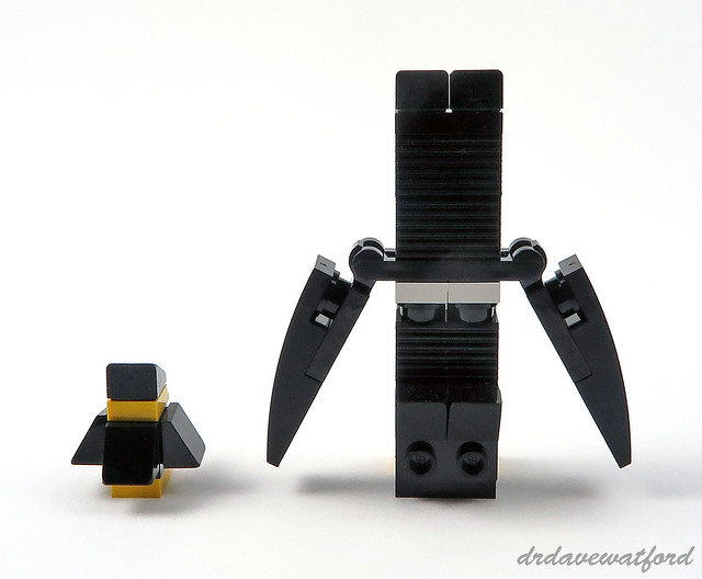
Some texture is added to the rear of the main build (below) via the use of black modified 1 x 2 bricks with grille, although to be honest it's barely worth the effort since from behind it's completely unrecognisable as a penguin anyway....


LEGO has produced a few brick-built penguins over the years, but as far as I can tell these Pick-a-Model penguins are the first standalone brick-built penguins that LEGO has released since 2009 when the little fellow below briefly appeared in stores as a Mini Monthly Build. Since then all we've had from a brick-built perspective have been the teeny, TNT-toting remote-controlled penguins included in 76010 Batman: The Penguin Face off from 2014, although we have at least had a couple of cute one-piece moulded penguins to tide us over, specifically this one and this one, not to mention Penguin Boy from the latest series of collectable minifigures and even a Duplo effort for good measure.


While I do think that the Pick-a-Model penguins are quite cute (below) it's hard to dispute the accusation that this 'set', and indeed the other Pick-a-Model builds, offer rather poor value for money. In my case this concern was partially mitigated by the fact that store staff were happy for me to stuff the compartments in the blister pack with as many elements from the Pick-a-Brick wall as I could fit in, meaning that in practice I actually had enough elements to build multiple copies of the set rather than just the one. I'm not however sure if all stores will interpret the rules so liberally, and I'd be interested to hear whether other customers have had the same experience as I have. I also have some sympathy with the concern that this initiative reduces the number of Pick-a-Brick element slots in stores, although to be honest the selection is so limited anyway that the chances of finding exactly what you're looking for were already pretty miniscule.


In summary, Pick-a-Model is an interesting attempt by LEGO to increase visitor engagement with the Pick-a-Brick wall. Providing store staff continue to allow me to completely fill the element compartments in the blister pack, and LEGO's designers can offer up some appealing little builds, then there's a reasonable chance that I'll pick up more of them in future.

Monday, 10 October 2016

Station!

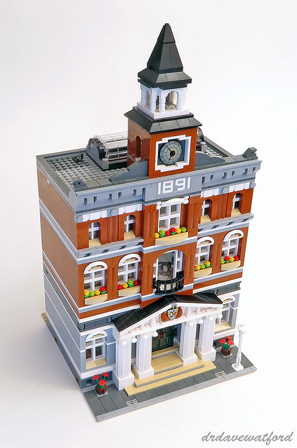
Back in June of this year I posted a review of Set 10224 Town Hall (below). One of the reasons for building the Town Hall when I did, and indeed building Set 10243 Parisian Restaurant a few months earlier, is that I was planning to use these and other Modular Buildings to populate my work-in-progress LEGO city layout, at least until such time as I got around to designing and building a few suitable MOCs of my own to take their place.


Having finished building the Town Hall and placed it alongside a couple of other Modular Buildings, however, I started having second thoughts about dropping it into my layout. It dwarfed the surrounding buildings and just didn't look right positioned alongside them. So what to do with it, then - should I just omit it from my layout? Thankfully an alternative solution occurred to me. On account of the Town Hall's clock tower, its dark orange colour and its arched windows I've always thought that it was vaguely reminiscent of London's historic and spectacular St. Pancras railway station (image below from Architecture Week); given that I was planning to include a railway station in my layout, why not try to repurpose the Town Hall into a railway station?


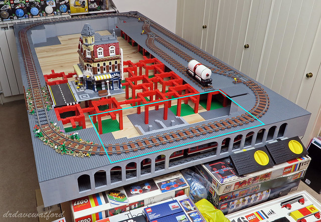
The more I thought about it the more I liked the idea, although it was immediately evident that there would be a fair bit of work to do. For starters, the Town Hall would have to be expanded substantially to do the job. You can see the intended location of the station marked in blue on the picture of my layout below. The plan is for the station to occupy a total area of 96 studs by 48 studs, which would mean expanding the Town Hall to three times its original width and also constructing a 16-stud wide canopy at the rear to overhang the station platform and railway track.  


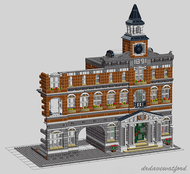
So how to proceed? Well, I'm a big fan of sketching things out virtually before diving into the bricks, and my sketchpad of choice is LEGO's own virtual building tool LDD which you can download for free from here if you don't already have it. The first thing I needed to do was to find an LDD file for the Town Hall, and in this regard I was indebted to Eurobricks which has a comprehensive library of LDD files of official sets which have been virtually assembled by Eurobricks members. Having located and downloaded the Town Hall LDD file I then spent a couple of hours on LDD virtually sketching out an idea for an expanded version which might conceivably fit into my layout. You can see a screen grab of my sketch below - I basically extended out the ground, first and second floors of the Town Hall, leaving an opening at ground floor level to provide access to a staircase down to the pre-existing subway platform below. A mirror image of the extension would attach to the right side of the Town Hall, creating a building which would occupy the best part of three baseplates in width.


Having arrived at a concept that I was basically happy with I was too impatient to develop the sketch any further and instead turned my attention to the job of sourcing the bricks I'd need to translate the concept into a full-blown LEGO model. Ideally I'd have taken the easy route and just shelled out for two additional Town Hall sets to part out for the elements that I'd need, but the price of the set has skyrocketed since its retirement, to the point where I'd likely have had to stump up between £350 and £400 for just a single unboxed copy. I therefore resigned myself to ordering the elements that I didn't already have from Bricklink and set about putting together a wanted list. This would of course have been a lot easier if I'd completed my LDD design rather than lazily skipping most of it, but as it was I ended up having to make a lot of educated guesses regarding of how many of each element I'd need. With my distinctly flaky wanted list drawn up, I placed a couple of pricy Bricklink orders and waited for the elements to arrive which they duly did over the next couple of weeks.


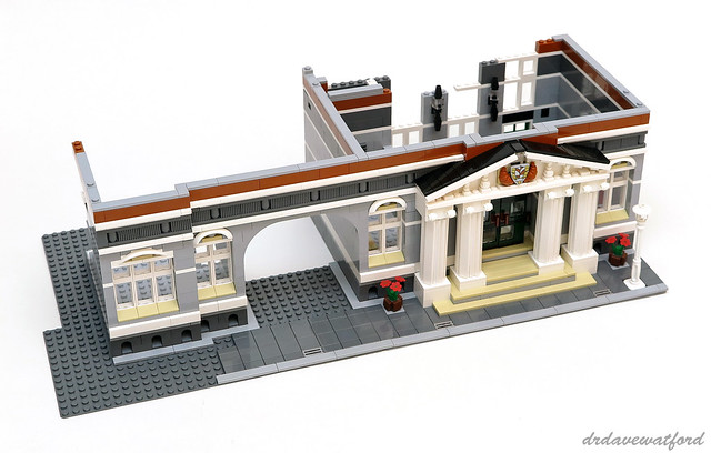
You can see the ground floor modifications above (click to enlarge). First of all I swapped out the Town Hall's tan baseplate for a dark bluish grey one; I anticipate that a small section of the side edge of the baseplate will be visible in the final build and I knew that I'd get irritated by the sight of a thin sliver of tan where there shouldn't be any. I then demolished the front left corner of the ground floor so I could attach the arch, after which it was basically a case of following my LDD sketch. My intention was as much as possible to incorporate architectural features and visual cues from the original Town Hall in the hope that my modifications didn't jar too much and the building ended up looking like a coherent whole rather than a Town Hall with a bunch of random stuff tacked on to it. Consistent with the original Town Hall design each floor of the building is topped off with tiles so that it can be readily detached from the floors above and below; this obviously provides access to the interior as well as making the model a bit more portable which will be welcome in the event that I ever manage to finish the layout and need to transport it. With the front of the ground floor extension complete I moved on to the first floor extension (below).


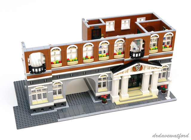
The first floor extension incorporates three additional windows which are pretty much identical to those found in the Town Hall's first floor, right down to the window boxes and the use of white car mudguards for the cornicing. I also constructed a variation on the Town Hall's central first floor doorway and balcony on the front left corner of the extension which required a bit of modification to get it to fit neatly on top of the corresponding section of the ground floor. As mentioned in my review of the Town Hall some of the elements found in the set such as the dark orange 1 x 8 x 2 arch, which you can see above the balcony, are fairly uncommon although thankfully they aren't very expensive on Bricklink; the dark orange modified 1 x 2 log bricks that you can see between the windows are also fairly uncommon, appearing in just 13 sets in total, but again they're thankfully inexpensive and also surprisingly adundant on Bricklink which is a relief given how quickly I burned through them while building this floor.


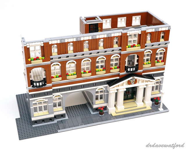
My strategy for the second floor extension (above) was basically the same as that for the first floor - build some additional windows similar in design to those in the Town Hall and then reproduce the central second floor feature, in this case a larger window with ornate cornicing and a windowbox, and modify it slightly to fit on top of the corresponding section below. I also continued out the characteristic cornicing pattern, consisting predominantly of white modified 1 x 2 bricks with groove, and the light bluish grey detailing beneath the windows, into the extension. The dark orange 1 x 4 arches, which you can see above the smaller windows, were probably the hardest elements to source for this part of the build; they've only appeared in two sets to date including the Town Hall and aren't stocked by many Bricklink sellers.


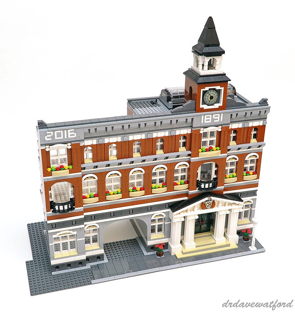
And so finally on to the roof (above). I did initially consider including a smaller version of the central clock tower on the front left corner of the roof, and I even had a play with a few designs, but the idea was eventually abandoned as everything I tried looked too fussy and it became evident that it wasn't really necessary. I did however retain the design of the balustrade running along the front of the roof, and I also decided to mark the construction of my Town Hall extension with the date that I started work on it; creating the '2016' numbering in the same style as the Town Hall's original '1891' provided an interesting challenge and I was glad that I had my Town Hall instruction booklets to hand.

With the extension on the left side of the Town Hall completed to my satisfaction the process of mirroring the design on the other side of the building should be considerably more straightforward, although I strongly suspect that I've underestimated how many bricks I'll need so another Bricklink order will likely be required. I also have to substantially modify the rear of the Town Hall to incorporate a station platform and a canopy to overhang it. I'll post an update when I've made further progress.